Set up the WX homepage
The WX homepage is a service page that shows by default when users sign in to Sage People. It can display special homepage components such as a carousel, time off overview, and external links. You can configure section titles and subtitles.
The homepage can display the following elements:
-
Homepage components, including:
-
Count summaries that show key statistics for your organization
-
Carousel summaries that display celebrations, achievements, and milestones for your staff
This page provides an overview of the WX homepage and how to configure its elements.
You need to set up a WX service as the homepage, otherwise WX services may not display correctly. The WX homepage must include at least 1 visible internal communication.
For tips on how to design your WX homepage, see Best practices for designing the WX homepage at the Sage People Community.


To create a WX homepage:
-
Configure an HR noticeboard (optional)
We've outlines these steps below.
Create a homepage service
To start building your WX homepage, first create a new service. We recommend that you:
-
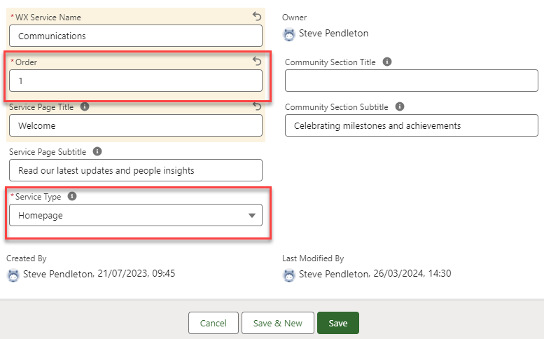
Set the service type to Homepage. Homepage services can host components such as the Time off overview
-
Set the service order to 1, so that the homepage appears before any other services. By default, the system uses the first service by order as a default homepage. If you need to, you can add other homepages later in the menu
See Creating a new WX Service.
Configure the homepage title
These fields on the New WX Service dialog control the greeting that displays to users at the top of the homepage, directly above the carousel. The default value for the greeting is Hi or the local language equivalent. The preferred name of the person viewing the page follows or precedes.
-
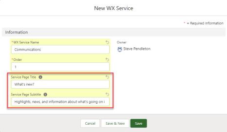
Service Page Title: You'll use this for personalized greetings. The default value for the greeting is Hi or the local language equivalent. The preferred name of the person viewing the page follows or precedes. This field might display by default. See Set up the WX homepage
-
Service Page Subtitle: a brief subtitle that appears under the page title. Leave empty for none
You can translate the title and subtitle in the same way as WX Service and Process names. See WX Translations | Translating WX Service and Process names.
If you have no items in the carousel, no title shows.
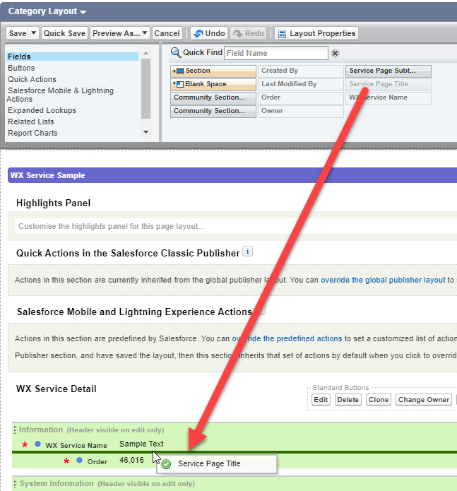
These fields might not display by default. To add them, update the WX Service page layout. See How to update the WX Service page layout.
Configure the community section title
These fields on the New WX Service dialog provide a title and subtitle that appear above the community summaries section:
-
Community Section Title: a heading for the community updates section that displays summary processes. If empty, the system uses the default label "Community updates"
-
Community Section Subtitle: a brief subtitle that appears under the community updates section title. Leave empty for none
You can translate the title and subtitle in the same way as WX Service and Process names. See WX Translations | Translating WX Service and Process names.
If you have no carousel summaries, no title shows.
These fields might not display by default. To add them, update the WX Service page layout.
-
Go to Setup , and select the WX Service object.
-
Select Page Layouts.
-
Select the page layout you use for your WX services.
-
Select the Service Page Title field from the panel at the top of the page. Drag it to the WX Service Detail section.
-
Repeat the process to add the additional fields as you require:
-
Service Page Subtitle
-
Community Section Title
-
Community Section Subtitle
-
-
Select Save.
For more information about updating page layouts, see Page layouts, search layouts, related lists.
Configure an HR noticeboard
An optional HR noticeboard can function as a banner at the head or foot of the homepage.
Noticeboards are always the first or last item on a homepage, appearing either above the page title and carousel, or directly before the page footer. You can set noticeboards to appear on homepages, My Profile services, process pages, or any service page that contains only Internal Communications or Summary processes. You can include images, plain text, rich text, or an image and plain text.
Using a noticeboard/banner is optional, but can add character to your page.
For accessibility, we recommend you don't include text embedded in a banner image, because this isn't suitable for assistive technologies.
See HR Noticeboards
Configure the Internal Communications carousel
The homepage carousel can host up to 20 internal communications as interactive tiles that the user can scroll. Typically these include links to articles or announcements of interest to your staff. This can include leadership messages, employee surveys, or videos.
To avoid any issues in displaying the homepage, make sure you always have at least 1 visible internal communication.
Use engaging images that work well when you crop them to a square aspect ratio. Don't include text embedded in your images. Use the Show Title in Tile option to display a text title beneath the image.
The system orders tiles in the carousel according to the relative values of the Order setting for the process. Lower numbered processes display first.
Best practice is to include no more than 7-10 items in a carousel. Adding more can make the carousel difficult to navigate. Refresh the items in your carousel regularly to keep your homepages interesting and relevant. If you need more than 20 items, consider creating a separate homepage/service page to host other internal communications.
See Internal Communications | Set up Internal Communications.
Set up homepage components
Immediately beneath the internal communications carousel, dedicated homepage components display.
Configure the time off overview
The Time off overview component displays automatically on any services that you set as a Homepage service. This component displays a summary of the logged-in user's upcoming time off, their current vacation balance, and the next public holiday. The component also includes a link to your time off process.
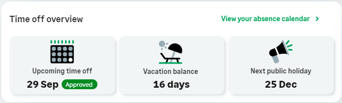
The Time off overview component shows the following cards:
-
Upcoming time off: always displays in the component. If the team member has no booked holidays, the default label "Nothing booked yet" shows
-
Vacation balance: shows the remaining balance for the team member's default holiday rule. The card displays as long as the team member's absence accrual rule has at least one of the following settings selected: Show Year End Balance, Show Accrued Total, or Show Accrued Balance. The balance amount that the system uses is decided as follows:
-
The system uses the Show Year End Balance figure if you select this option
-
The system displays the Show Accrued Total figure if you select it and you don't select Show Year End Balance
-
The system displays the Show Accrued Balance figure if you select it and you don't select either of the other two balance types
-
Configure external links
The External links component displays your external links alongside icons, beneath the internal communications carousel. Links open in a new browser tab.
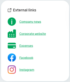
The system configures external links as a special type of Internal Communication. The External Links component will appear on your homepages if you have assigned Internal Communications to the service that use the "Quick Link" tile type.
Before configuring external links, you might need to add the Quick Link tile type to the Internal Communication object.
To support the external links component, you need to create a new Internal Communication tile type.
Before you can add external links, you need to add the new tile type as a pick list value to the Internal Communication object.
To add the Quick Link picklist value:
-
Go to Setup , and select the Internal Communication object (
fHCM2__Corporate_Notice__c):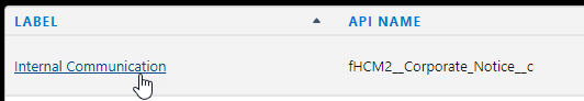
-
Select Fields & Relationships.
-
In Quick Find, enter "Tile Type". Select the Tile Type field label.
-
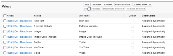
Scroll to the Values section, and select New.
-
Enter the text "
Quick Link" (without quotation marks) and select Save. -
Select Edit beside the value you just added, and edit the Label field to read "External Link". This is the name of the tile type as it will display in the HR Manager portal. You can choose any name you like, or leave it as "Quick Link" if you prefer.
Note"External links" is the default name of the component as it appears on WX homepages.
-
Select Save.
Add links to the component
To add a link to the external links component:
-
In the HR Manager portal, go to WX Services.
-
Select the service to which you want to add your external link.
-
Select New WX Process.
-
Give the process a Label and Order in the usual way:
-
The Label is the name of the link as it appears to users in the external links component. Use the process label to describe the link
-
The Order defines the order in which the link appears in the component, relative to other external links
-
The system doesn't use the Preferred Number of Columns setting
See Creating a new WX Process for more information about the settings on this page.
-
-
Set the process type to Internal Communication.
-
Under WX Internal Communication Settings, select New beside WX Internal Communication.
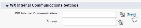 Note
NoteIf you've already created an Internal Communication for the link, find it using Lookup
 .
. -
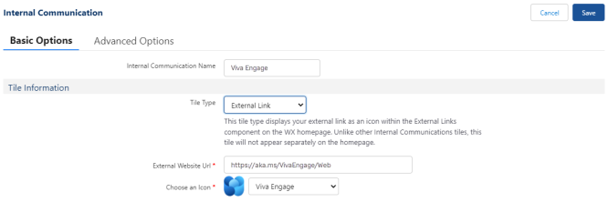
Give the Internal Communication a descriptive name.
-
Select External Link as the tile type. This is the name of the picklist value you’ve added.
The Detail Information section disappears. External links don't have a detail page.
NoteUnlike other Internal Communications tiles, this tile type doesn't appear separately on the homepage. External link "tiles" only appear in the external links component.
-
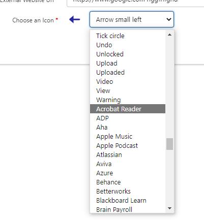
Choose an icon for the link using the dropdown menu. A preview displays beside the menu. The system sorts available icons in the list as follows:
-
Generic icons display at the top of the list
-
Brand icons display at the bottom of the list. (Brand icons are icons for popular tools from Microsoft, Google, ADP, and many other large companies)
 Tip
TipTo scroll through the available icons displaying a preview for each one, select an item from the dropdown menu. Then use the Up and Down keys on your keyboard to scroll through the list. The preview icon updates each time.
-
-
Select Save.
Add community updates
Count and carousel summaries are summary processes that show at the bottom of the homepage.

You can configure the title and subtitle that appears for this section. Otherwise the default text "Community updates" displays as the section heading. See Configure the community section title.
For information about configuring summary processes, see Set up Summary processes.
Count summaries
You'll use count summaries to display key facts and statistics about your organization. This can include things like your company's current headcount, or the number of new hires this month. Count summary processes show beneath your homepage components and above any carousel summaries.
Carousel summaries
You'll use carousel summaries to display celebrations, achievements, and milestones for your staff. This can include things like anniversaries, birthdays, or new hires. Carousel summaries display in a dedicated section at the bottom of the homepage.