The C suite dashboards are based on data from the entire organization, and are delivered separately from the team lead dashboards in WX.
Your administrator can provide the link to view the C suite dashboards.
To view the dashboards:
Go to the URL provided by your administrator, and log in to Sage People.

In the menu, select the service hosting Workforce Insights. In this example, the service is called Workforce Insights but it may be differently named in your organization. Then select a dashboard:
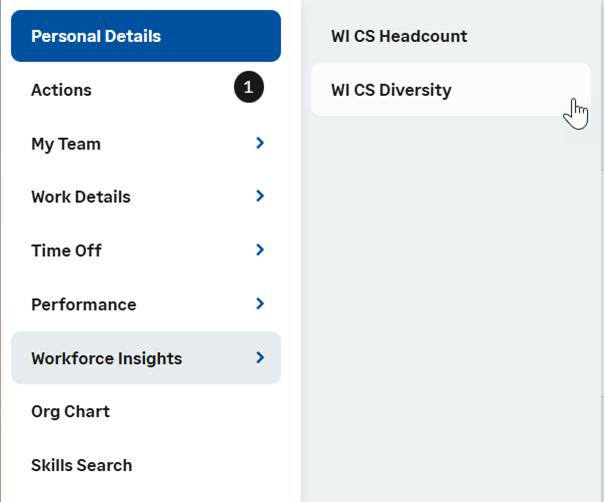
If you have access to both team lead dashboards and the C suite dashboards, select the Workforce Insights process you want to view:

Sage People

Your administrator can choose which dashboards are available to you.
At the top of the dashboards, you can select the tab you want to view:
In the Filters section:
-
Apply the Country filter to all cards and charts in the dashboard. You can use various operators to select the countries you want to include or exclude. The Country filter is based on the country of the Work Location selected in the Employment Record. A value of XXX is inserted for records with blank Work Location value.
-
Apply the Employment type filter to all cards and charts in the dashboard. You can use various operators to select the countries you want to include or exclude. The filter is based on the values of the Basis field in the Employment Record, with the No Type value inserted for any records with blank values.
-
Apply the Department filter to all cards and charts in the dashboard. You can view a list of all departments in your organization, based on the department linked to each team member.
On the title bar on the right, you can view the date and time when the dashboard data was refreshed, and switch between high contrast view on and off (the default is off):

Dashboards
This section provides brief descriptions of the cards and charts in the dashboards, what key fields are used, and how the figures are calculated to give you a basic idea what the data is.
Headcount dashboard
All cards and charts in the Headcount section consider active employees only. Active employees are those whose employment start date is today or earlier, and for whom Has Left in the Team Member record is false.
The Headcount dashboard consists of the following cards and charts:
- Headcount
Displays the total count of active employees in the organization as a number.
-
FT equivalent
Displays the number of employees as a full time equivalent (FTE) number. The FT equivalent chart counts all the hours worked by the total number of employees and translates it into full time equivalents (FTE).
-
Actual FT
Displays the actual number of full time employees. If all employees work full time, Actual FT and FT equivalent are the same.
-
Headcount by type of employment
Displays a donut chart with the proportion of different employment types in the headcount. Employment types are based on the values of the Basis field in the Employment Record. Records which do not have a value for Basis have a value of No Type inserted in the data recipe.
On hover over a section of the chart, displays the employment type and the headcount for that type.
-
Headcount by country
Plotted on a map, displays the headcount for each country in the organization. An employee's country is determined by the country of the Work Location linked to their employment record. If the country has no value, the data recipe inserts a value of XXX.
On hover over a country on the map, displays the name and three-letter code of the country and the headcount for the country.
Tenure
All cards and charts in the Tenure section consider active employees only. Active employees are those whose employment start date is today or earlier, and for whom Has Left in the Team Member record is false. If an active employee has more than one employment record, then all their employment records are considered.
The Tenure dashboard displays the following cards and charts:
-
Average tenure
Displays the average tenure length of currently active employees to date as a number of years.
-
Tenure by country
Plotted on a map, displays the length of average tenure of currently active employees for a country in the organization. The chart uses the Country field in the Work Location object to determine an employee's country.
-
Tenure by type of employment
Displays a bar chart with the length of average tenure for currently active employees in years for each type of employment in the organization. Employment types are based on the values of the Basis field in the Employment Record. Includes a line for average tenure length across the entire organization.
Organization design
The Organization design dashboard consists of the following cards and charts:
-
Future starts
Displays the number of employees who have been hired but whose employment start dates are in the future from today.
-
Future leavers
Displays the number of employees who have employment end dates set and in the future from today.
-
Organization shape (by country)
Displays a mirror bar chart, where the left bar chart displays the headcount number and the right bar chart the average salary for a country. Both charts consider active employees only: active employees are those whose employment start date is today or earlier, and for whom Has Left in the Team Member record is false. The charts use the Country field in the Work Location object to determine an employee's country. The average salary is based on the Annual Salary Reporting value in the Employment Record for each employee.
-
Organization shape (by type of employment)
Displays a mirror bar chart, where the left bar chart displays the headcount number and the right bar chart the average salary for a type of employment. Both charts consider active employees only: active employees are those whose employment start date is today or earlier, and for whom Has Left in the Team Member record is false. Employment types are based on the values of the Basis field in the Employment Record.
View details for dashboards
The View details buttons are specific to the dashboard selected. Select View headcount details, View tenure details or View organizational details to view the section's by country and by type of employment cards next to summary tables:

If you select an area of the dashboard, the table updates to display values for the selection.
Select Go Back to return to the main dashboard.
Diversity dashboard
All cards and charts except the leavers chart in the Diversity dashboards only consider employees for whom Has Left in the Team Member record is false.
The Diversity dashboard consists of the following cards and charts:
-
Employees by gender
Displays a column chart with a column for employees of every gender used in the Gender field in the Team Member object.
-
Employees by age group
Displays a column chart with a column for employees of every age group in your organization. The following groups are used: 0-20, 20-29, 30-39, 40-49, 50-59, 60-69, >70. If an age group is not represented in your org, no column is displayed.
-
New hires by age and gender in past 12 months
Displays a column chart with a column for every gender of every age group represented in the new hires with a start date in the past 12 months in your org. The age groups are displayed on the X axis and the gender is represented by different column colors.
-
Leavers by age and gender in past 12 months
Displays a column chart with a column for every gender of every age group represented in the leavers from your org with the month of the employment end date in the past 12 months. The age groups are displayed on the X axis and the gender is represented by different column colors.
-
Pay gap by gender
Displays a column chart with the average annual salary (using the Annual Salary Reporting field from the Salary record) for every gender in your org.