Example: Reason for leaving
This example creates a simple dashboard with 3 basic charts on reasons for leaving in your org:
-
A bar chart displaying the number of leavers for each reason for leaving
-
A donut chart displaying the number of leavers for each leaver category
-
A stacked bar chart displaying the number of leavers for each reason for leaving in each division
The example assumes your org has the following fields available:
-
Reason for Leaving picklist. This field is typically created as part of Sage People implementations and hosted in the Employment Record object.
-
Leaver Category picklist. This field is typically created as part of Sage People implementations and hosted in the Employment Record object.
-
Division. The example uses the Division field in the Team Member object, but you can use the Division Name field in the Employment Record, or one of the other business hierarchy fields in the Employment Record (Business Name, Team Name), or a custom field you have for this purpose.
Create a dataset
-
From the App Launcher, select Analytics Studio.
-
From the sidebar, select Data Manager.
-
From the sidebar, select Recipes.
-
Select New Recipe.
-
On the recipe builder canvas, select Add Input Data.
-
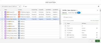
Search for the and select the fHCM2__Team_Member__c object:
-
In the right panel, review the fields and select the ones you need for the dashboard, typically:
-
Id
-
IsDeleted
-
Division, if you use this field in the Team Member object rather than Division Name in the Employment Record object.
-
Current Employment
-
Has Left
-
Manager, if you want to display team specific reports to managers and need to apply a security predicate.
-
-
After selecting the Team Member object fields, search for and select the fHCM2__Employment__c object.
-
Select the fields for the Employment Record object, typically:
-
Id
-
IsDeleted
-
Active
-
End Date
-
Team Member. You need this field to join the data together.
-
Reason for Leaving
-
Leaver Category
-
-
When you have selected the fields for the Employment Record, select Next.
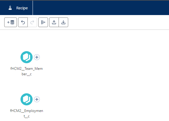
The objects you selected are displayed as input nodes on the recipe builder canvas:
-
Select + next to the Team Member node and select Filter.
-
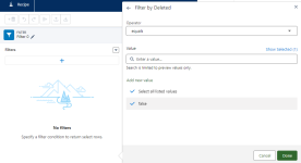
On the Filters panel, select + and then select the Deleted field, and select the value false:
-
Select Done.
-
Select the Edit pen icon in the header of the Filters panel to give a name to the filter. Giving the filter a descriptive name makes it easier to work on the recipe builder canvas. Select Apply to save the filter name.
-
Select Apply to return to the recipe builder canvas.
-
Add a similar filter node to the Employment Record node.
-
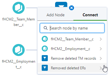
Select + next to the last node for one of the inputs, select the Connect tab, and select the node at the end of the other input:
-
Select Join.
-
On the Join panel, select Join Type as Left Join.
-
Review the automatically assigned Join Keys:

You need the Record ID of the Team Member records to match with the Team Member field in the Employment Record.
-
Select the Edit pen icon in the header of the Join panel, and give the join a descriptive name, then select Apply.
-
Select Apply at the end of the Join panel.
-
On the recipe builder canvas, select + for the join node, and select Filter.
-
Add a filter for only including team members for whom Has Left is true.
If you do not want to include leavers for all time, you can also add a filter for End Date using relative dates. For example, you want to include leavers from the past three years.
-
Give the filter a name, and apply the filter.
-
On the recipe builder canvas, select + for the last filter node, and select Output.
-
On the Output panel, complete the fields as follows:
Field What to enter Write To Picklist, defaults to Dataset.
Dataset Display Label A descriptive name for the dataset, displayed where datasets can be selected. Dataset API Name If left blank, automatically completed. App Location Typically defaults to My Private App.
Select x to clear the selection, and select the CRM Analytics app where you host your custom datasets and dashboards.
Do no select Sage People supplied apps.
Sharing Source Not used. Security Predicate If you want dashboard users to see all data, leave blank.
If you want to managers to only see data for their teams, enter a security predicate ???? details to be added ?????
-
Give the output node a descriptive name.
-
Select Apply for the Output panel.
-
On the recipe builder canvas, select Save and Run.
Data Manager displays the Save Recipe dialog.
-
Enter a name and an optional version description for the recipe and select Save.
Create the dashboard
-
From the App Launcher, select Analytics Studio.
-
On the Analytics Studio home page, select Create, and then select Dashboard.
-
On the Create Analytics Dashboard screen select Create Blank Dashboard.
Analytics Studio displays a new blank dashboard.
Create a bar chart for reasons for leaving
-
From the left sidebar, select Chart and drag it on the dashboard designer canvas.
-
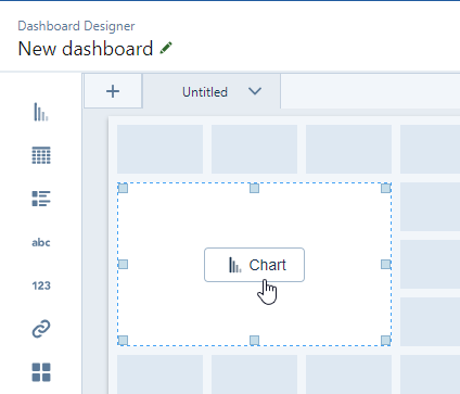
When the chart widget is on the canvas, select the Chart button in the middle:
Analytics Studio displays the Select a data source dialog.
-
Select the dataset you created in previous steps.
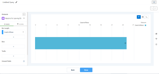
Analytics Studio displays the query builder:
-
From the left sidebar, select + under Bars.
-
Search for and select the Reason for Leaving field.
Query builder displays a preview of the chart.
-
In the top left corner, select the Edit pen icon to rename the query so it is easier to find it again.
-
Select Done.
-
On the dashboard designer canvas, adjust the size of the chart if necessary.
-
Select the chart to view the Widget options on the right sidebar. You can add text to the chart and change its look and feel.
-
When you are finished with the chart, select Save.
Analytics Studio displays the Save Dashboard dialog.
-
Complete the following fields as a minimum:
Field What to enter Name Enter a name for the dashboard. App Select the app where you want to store this dashboard.
Do not select SP Workforce Insights Embedded App.
-
Select Save.
Create a donut chart for leaver category
-
From the left sidebar, select Chart and drag it on the dashboard designer canvas.
-
When the chart widget is on the canvas, select the Chart button in the middle.
Analytics Studio displays the Select a data source dialog.
-
Select the dataset you created in previous steps.
Analytics Studio displays the query builder.
-
From the left sidebar, select + under Bars.
-
Search for and select the Leaver Category field.
Query builder displays a preview of the chart.
-
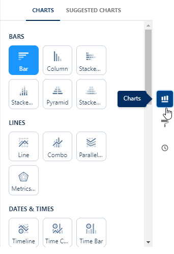
On the right side of the query builder, select the Charts icon.
Analytics Studio displays the chart options:
-
Scroll down to the Circles and Dots section and select Donut.
-
In the top left corner, select the Edit pen icon to rename the query so it is easier to find it again.
-
Select Done.
-
On the dashboard designer canvas, adjust the size of the chart if necessary.
-
Select the chart to view the Widget options on the right sidebar. You can add text to the chart and change its look and feel.
-
When you are finished with the chart, select Save.
Create a stacked bar chart for reasons for leaver per division
-
From the left sidebar, select Chart and drag it on the dashboard designer canvas.
-
When the chart widget is on the canvas, select the Chart button in the middle.
Analytics Studio displays the Select a data source dialog.
-
Select the dataset you created in previous steps.
Analytics Studio displays the query builder.
-
From the left sidebar, select + under Bars.
-
Search for and select the Division field.
Query builder displays a preview of the chart.
-
Select + under Bars again.
-
Search for and select the Reason for Leaving field.
-
On the right side of the query builder, select the Charts icon.
Analytics Studio displays the chart options.
-
Select Stacked Bar.
-
In the top left corner, select the Edit pen icon to rename the query so it is easier to find it again.
-
Select Done.
-
On the dashboard designer canvas, adjust the size of the chart if necessary.
-
Select the chart to view the Widget options on the right sidebar. You can add text to the chart and change its look and feel.
-
When you are finished with the chart, select Save.
Add a title for the dashboard
-
From the left sidebar, select Text and drag it on the dashboard designer canvas.
-
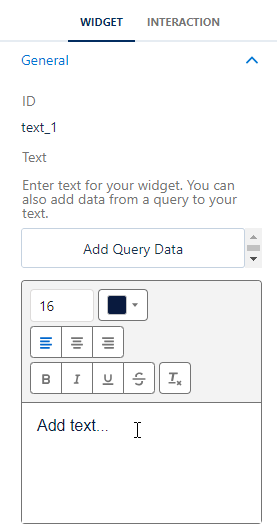
On the right side panel, on the Widget tab, add the title you want to use in the rich text field:
Display the report for users
???? details tbc ????
